a senior product designer
who builds interfaces that disappear into the experience, guiding users forward without a second thought.
Melbourne, AU
Creating charts without starting from scratch
Redesigning Cascade’s chart creation experience to help new users reach value faster, without limiting the flexibility advanced users needed.
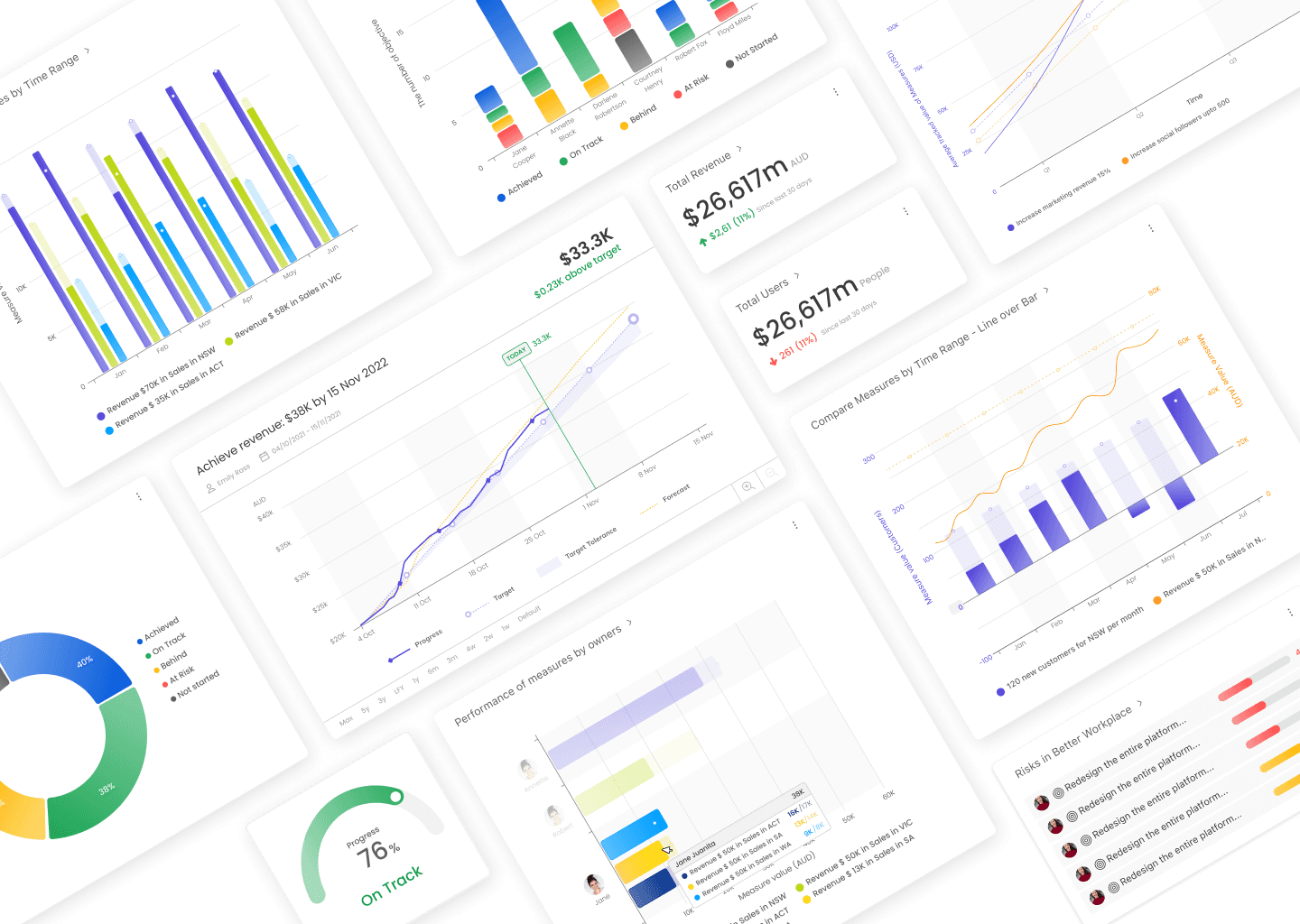
Company
Cascade Strategy
Overview
B2B SaaS
Data Analytics
Time-to-Value
Role
Research & Roadmap
End-to-end UXUI design
Hand-off & Design QA
Success metrics
Collaborate with
PM
Software Engineers
Customer Success
Data Analysts
42% → 22%
Chart creation abandonment
7–15 → 1–2 min
Time to create a chart
100%
Tested users found it more intuitive
01 · THE CHALLENGE
A blank canvas wasn’t a neutral starting point.
As part of Cascade’s next-generation platform rebuild, I led the redesign of the dashboard and chart creation experience.
The existing chart builder opened with unfamiliar terminology, hidden configuration options, and no clear sense of what users could create. 42% abandoned the flow before completing a chart.
01
CASUAL & FIRST-TIME USERS
“Show me what’s possible.”
They needed guidance, relevant examples, and a faster way to reach a useful result.
02
POWER USERS
“Let me shape the data.”
They needed control over data sources, chart types, filters, and visual configuration.
How could we reduce the effort required
to create a first chart without limiting advanced users?
02 · RESEARCH
Finding where
confidence broke.
I combined interviews, usability testing, session recordings, and feedback from customer-facing teams to understand both behaviour and the reasons behind it.
5
ICP Interview
6
User interview
2
Usability scenarios
Hotjar & CSM recordings


01
No clear starting point
Users couldn’t tell which chart to choose, what data was required, or what the final result would look like.
02
Fragmented configuration
Important controls were hidden in a narrow sidebar, forcing users to scroll and repeatedly check earlier selections.
03
One flow couldn’t serve everyone
Guidance helped casual users, while experienced users needed freedom to explore and configure.
03 · PRODUCT STRATEGY
One need.
Two creation paths.
Rather than forcing everyone through one compromised workflow, I proposed two complementary paths: templates for speed and a builder for control.
01
FAST START
Widget Templates
Start from a proven chart, make only essential decisions, and deliver value immediately.
+
02
FULL CONTROL
Custom Chart Builder
Explore raw data, combine attributes, and build around more complex use cases.
THE TRADE-OFF
Sequence value before complexity
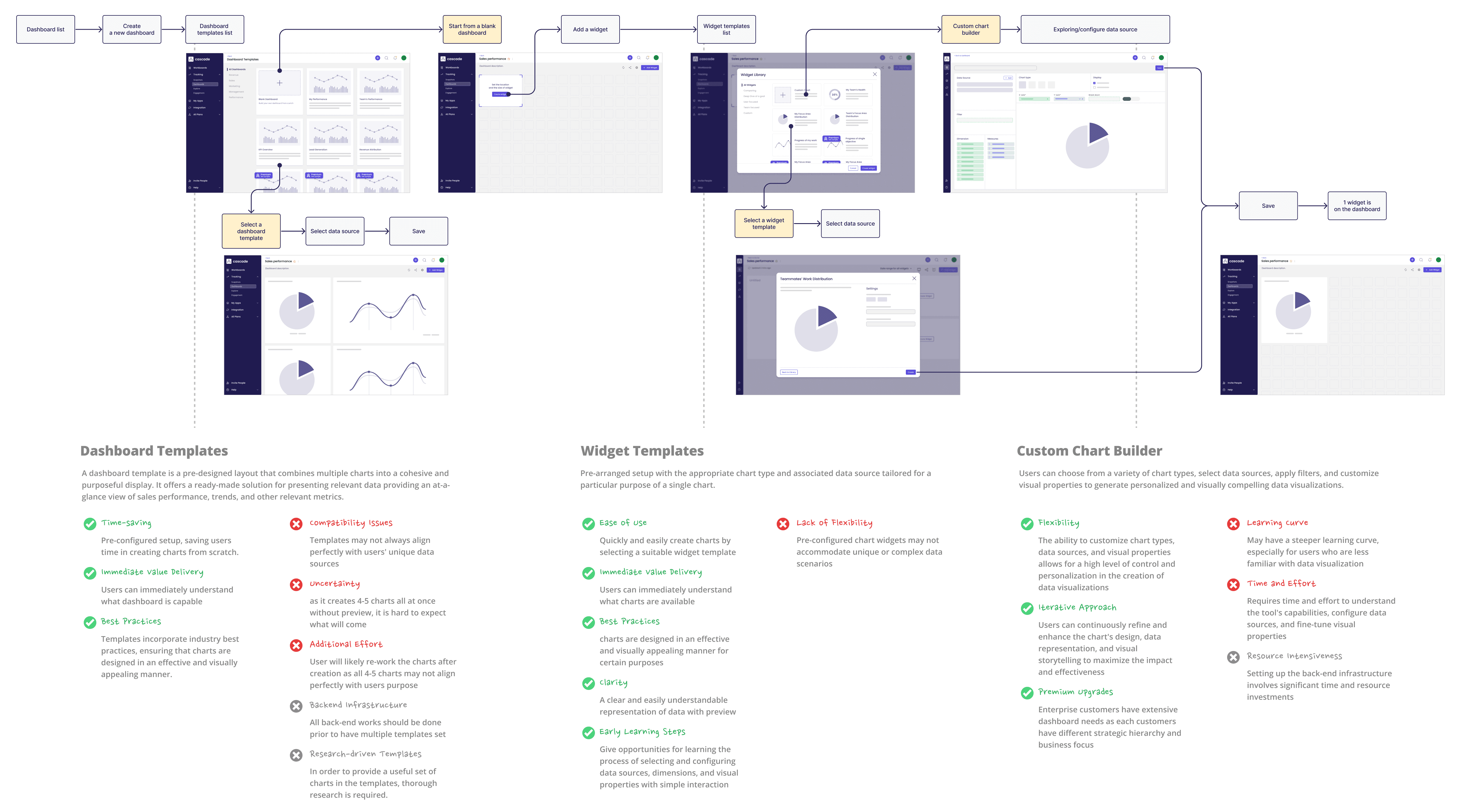
We evaluated dashboard templates, widget templates, and a custom builder against user value, technical readiness, product maturity, and scalability. Widget Templates offered the strongest balance of immediate value and incremental delivery.
04 · SOLUTION / PHASE 1 - Widget Templates
A faster path to a useful chart.
Ready-made charts gave users a clear starting point and reduced configuration to only the decisions that mattered.
Widget Templates - Decision 01
Show the outcome before configuration

Guide users to easily find the desired chart through categorising tabs by purpose on the left side.
Clear title and description with thumbnail images help users know what to expect beforehand.
Before

Unclear what the difference is between Quick Start and Custom.
Some icons and descriptions didn't match what users expected.
Widget Templates - Decision 02
Reduce setup to essential decisions

The chart configuration process within the widget template can be completed with just a couple of clicks, as the chart type and data source are pre-configured for optimal use. Users can quickly add charts to their dashboard and discover the capabilities and value.
Moved the title field to the final step and made it optional, so users can skip it during setup. In-line title editing is also enabled directly on the dashboard.
Before

Too many clicks and decision-making steps involving scrolling, leaving users confused and fatigued during chart creation
Users frequently forgot to type the title, triggering an error state since it was a mandatory field, an unnecessary source of friction at this stage.
Widget Templates - Decision 03
10+ templates in the first release
Selected using customer use cases, ICP needs, onboarding data, technical feasibility, and visualisation best practices.
05 · SOLUTION / PHASE - Custom Chart Builder
Full control without
hidden complexity
The Custom Chart Builder moved configuration out of a narrow sidebar and into a workspace where users could explore their data and its output together.
Custom Chart Builder - Decision 01
Make the full workflow visible

The custom chart builder occupies the entire screen, allowing users to view all the elements involved in configuring a chart at once, without scrolling or anything hidden.
This comprehensive view helps users understand what to do at a glance.
Before

Inefficient linear workflow. Users continuously scroll up and down, verifying their selections and switching attributes within the confined space of the sidebar.
Hidden areas appeared as users scrolled down, requiring more input than expected and causing user fatigue.
Custom Chart Builder - Decision 02
Show what is available
Configuration options vary depending on the chosen chart type, so users need immediate clarity on what's available. The interface clearly indicates active and disabled states for configuration options across different chart types, providing instant visual feedback.
This enables users to easily understand which options are applicable for their specific chart configuration.
Before

All configuration options were selected from a dropdown menu, but it was hard to tell which options applied to the current chart type. Users had to reopen the dropdown every time they changed chart types, making it easy to lose track of context.
Custom Chart Builder - Decision 03
Make exploration direct
The drag-and-drop interactions empowers users to create customisable charts intuitively. The visual cues of green and blue colours provide guidance on which elements correspond to specific attributes, facilitating a clear understanding of how each element and attribute interact with one another and impact the resulting data visualisation.
06 · OUTCOMES
Less setup.
More confidence.
The redesign didn’t just make chart creation look simpler. It removed the uncertainty that had been driving abandonment.
42% → 22%
Abandonment
Clearer entry points and next steps reduced chart creation abandonment by 20 percentage points.
7–15 → 1–2 min
Task time
Preconfigured templates shifted attention from setup to the intended outcome.
100%
Positive usability feedback
Every tested participant familiar with the previous version found the redesign more intuitive.
“The new UX is much more conducive to our goals.”
Internal product team feedback

07 · REFLECTION
The strongest solution wasn’t one workflow that tried to satisfy everyone. It was a product strategy that gave each user the right level of guidance at the right time.
What I’d measure next
Template adoption by user segment
Template-to-builder progression
Time to first meaningful chart
Repeat chart creation
Quote variation management 🔒
A connected workflow that helps businesses change project scope without losing financial history
B2B SaaS
Workflow
Financial
Version Control

Redesigning trust, not just the streets
Service Design
Government
Local Community